
The File Uploader (Viewer) component has two purposes:
- Allow a user to upload and remove files to the form.
- Allow the designer to upload files for the user to be able to view and download.
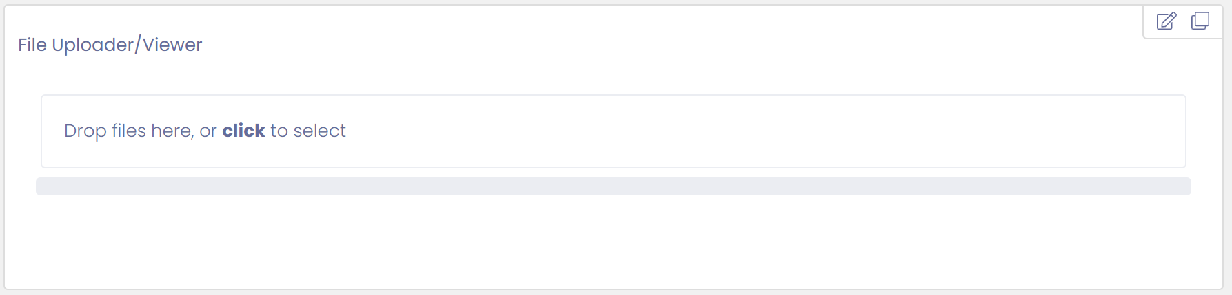
The File Uploader component has the following settings:
- Name: This defaults to a unique name, and is ready only.
- Label: Label displayed for text field
- Help Text: Help text displayed below field
- Editable by: Specifies who can edit this field - Everyone, Approver 1, Approver 2
- Can Upload Files
- Can Remove Files
Display Files to User
If you would like files to be displayed to a user then you should upload the files when designing the form. The files will be then linked to the form and displayed to the user when generated.
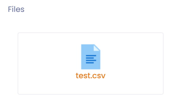
In order for this to occur you must un-check:
- Can Upload Files
- Can Remove Files
Allow User to Upload Files
Under this scenario you will not upload files during design of the form, instead users will upload files when filling out the form.
In order for this to occur you must check:
- Can Upload Files
and you must un-check:
- Can Remove Files
Allow User to Upload and Remove Files
Under this scenario you will not upload files during design of the form, instead users will upload files when filling out the form. In addition users will be able to remove any files they have uploaded.
In order for this to occur you must check:
- Can Upload Files
- Can Remove Files