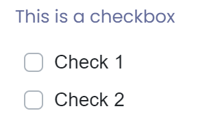
The checkbox component will display a list of checkboxes in a form, of which you can select one or more values.

The radio group component has the following settings:
- Name: This defaults to a unique name, and is ready only.
- Label: Label displayed for text field
- Help Text: Help text displayed below field
- Placeholder: Text that is displayed in field when no value has been entered
- Editable by: Specifies who can edit this field - Everyone, Approver 1, Approver 2
- Can Comment: Allow comments to be entered against field
- Whether to display the checkboxes horizontally
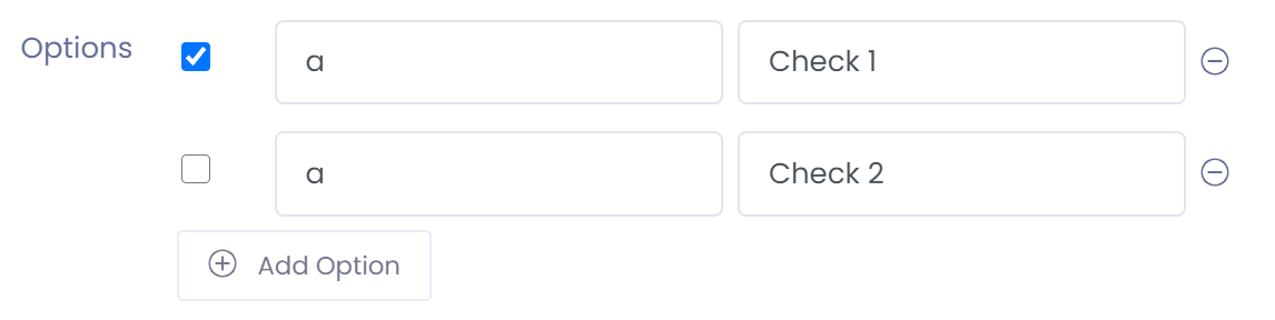
- Options: An option list can be built which consists of a value and a label. The label is what is displayed to the screen. The default value may also be applied by stating whether each checkbox is ticked or not.
When a form is loaded the checkbox component will look like: