The datetime field component will display a date and time in a form, which can be displayed in a variety of formats.

The datetime field component has the following settings:
- Name: This defaults to a unique name, and is ready only.
- Label: Label displayed for text field
- Help Text: Help text displayed below field
- Placeholder: Text that is displayed in field when no value has been entered
- Editable by: Specifies who can edit this field - Everyone, Approver 1, Approver 2
- Can Comment: Allow comments to be entered against field
- Show on List view: Show this field on the form list view
- Default Sort on List view: Use this field to sort the form list view - only one field on form should be set with this
- Required On Save: Whether or not the field is mandatory when form saved
- Required On Confirm: Whether or not the field requires a value before confirming form
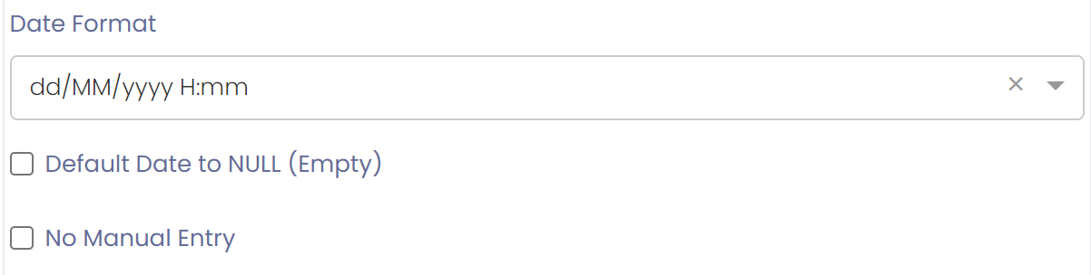
- Datetime format: Date formatting in a specified format
When a form is loaded the datetime will look like:

if the 'Default Date to NULL (Empty)' flag is ticked then when a form is loaded the date will be empty, and user will have to enter it.
Stop Manual Entry
If you would like to stop manual entry of the date and only allow it to be entered by pressing the 'Now' button then you can tick the 'No Manual Entry' flag for the field.